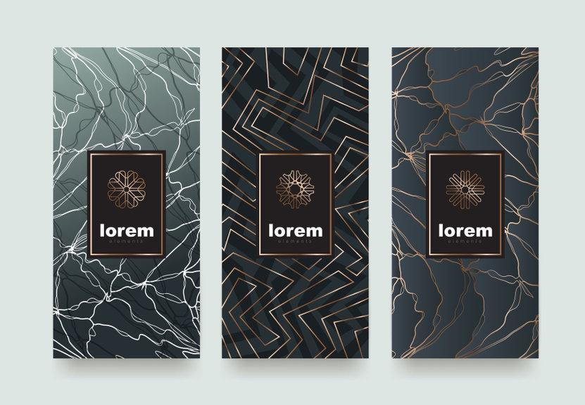
As a business owner, you probably already know how vital your packaging design is to the comprehensive impact of your brand. Your customer’s choice to purchase your product is often influenced by how much they like your design.
In previous articles, we’ve ventured through all the steps in the process of creating the perfect package design, as well as how product packaging design builds your brand. In this post, you’ll get to see some inspirational brands who are currently at the top of their game, with packaging design that communicates to their consumers in all the right ways.
1. We Compost
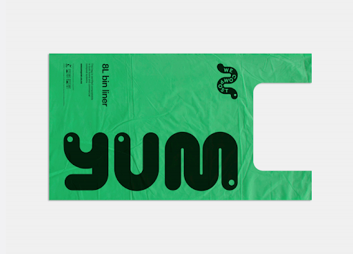
This New Zealand-based composting company took a creative approach with their waste bin liner concept. Instead of slapping on overused imagery such as trees, leaves, or recycle symbols for their product, they used oversized, abstract worm imagery, eye-catching colors, and lots of negative space. The effect is enjoyable to look at, modern, and easy to understand for their customers.
2. Hardy Smoked Salmon
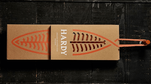
Hardy, a third-generation Portuguese family business, does one thing exceptionally well: smoked salmon. The brand’s packaging undoubtedly speaks to their ideals of sophistication, simplicity, and refined taste.
Their packaging depicts deconstructed salmon imagery, a creative peek inside to the product itself, and simple-yet-bold title font.
3. Callaly
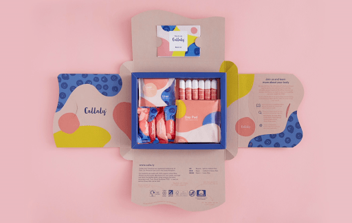
This feminine hygiene brand on the rise utilizes product design to communicate to its target audience: young, trendy women who are tired of the boring world of tampons and liners they’ve grown up using. Since this company has the option of subscription-based services, its product packaging needed to be both practical and enticing. Their designers decided to go with a petal-style fold-out box that has relevant information about the company on each panel.
The products are enclosed in packaging that is colorful, captivating, and modern, three words that you wouldn’t usually use for feminine hygiene products.
4. Western
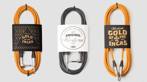
The design for these music cords is a shining example of when less is certainly more. A simple cord sleeve allows the product itself to act as part of the design. Classic, Western-themed fonts contribute to the brand story, and the stark white, black, and gold color scheme allow this product to shine on the shelves.
5. Granville Island Pet Treats
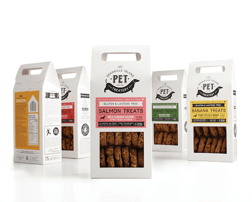
This Vancouver based “pet treatery” debuted packaging that appeals to the grocery and gift-buying markets simultaneously. The company benefits furry companions with food sensitivities, so their packaging design is based around transparency: see-through packaging to showcase the quality of the treats themselves, recognizable ingredients and a hierarchical design that shows off their clean products.
6. Yellow Beauty
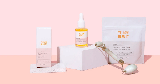
Yellow Beauty’s skincare line is centered around one star ingredient: turmeric, the nutritional powerhouse famous for its anti-inflammatory attributes both internally and externally.
Yellow Beauty’s packaging design is a prime example of typography as a sole design element. They might not have a logo in the usual sense of the word, but by familiarizing their customers with a recognizable color palette, a minimalistic color-blocked design, and aesthetic typography for all of the products in their line makes their products instantly “branded.”
7. All WellO
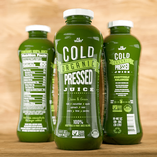
The concept for All WellO’s drink products is a stunning example of utilizing transparent packaging to let the product’s natural hues play a part in appealing to its audience.
This design trend is particularly strategic for brands whose commitment to all-natural, fresh ingredients is a defining aspect of their brand story. The clear packaging hints at an element of transparency in the company itself.
Product packaging is the perfect way to really show off your brand’s personality. It’s your way to flaunt your style, mission, and voice to your consumers.


